By Edy Werder — IT Consultant & Tech Blogger
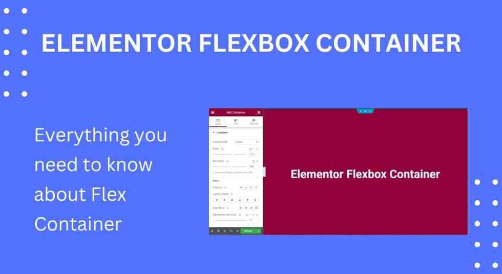
How to Use Elementor Flexbox Container?
The Elementor Flexbox Container is an impressive new feature of the well-known Elementor page builder plugin. It streamlines creating web layouts with accurate alignment and excellent element distribution, resulting in design consistency. This capability also enables you to overcome the constraints of developing extremely dynamic, interactive, and adaptable layouts.
As a result, the Flexbox Container is envisioned to soon replace Elementor’s traditional design process. In this tutorial, we’ll go over how to utilize the Elementor Flexbox Container in depth and its benefits and distinctions from the section-based design method. Without further ado, let’s get started!
What is an Elementor Flexbox Container?
The CSS Flexbox layout model idea is used by Elementor Flexbox Container to align and organize items flexibly. It functions as a parent box because it includes all of the elements like text, graphics, and widgets. Furthermore, the box governs the placement, distribution, and alignment of the items included within it. You can’t build as many sections as you wish within a single section with the section box-based Elementor. Furthermore, you cannot make a mapping for your page at the start. You must design the components above sequentially before going on to the next.
However, you may generate an initial mapping for your pages using Elementor Flexbox Content and then add widgets individually. You will get experience with website wireframing. As a consequence, Elementor Flexbox Container will quickly become a popular feature.
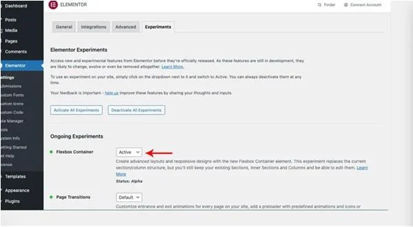
How to Enable Elementor Flex Container Element?
First, you must have an Elementor version greater than 3.6 installed on your website, then:
- In your WordPress Dashboard, navigate to Settings > Elementor.
- In the Elementor Dashboard, go to the Experiments tab.
- Scroll down to the Flexbox Container option and activate it.
- Then, at the base of the page, click Save Changes.
How to Use Elementor Flexbox Containers (Step-by-Step)
The Flexbox page builder Elementor is identical to the normal Elementor block builder. So, whether you’re new to Elementor or migrating from another builder, you’ll have no trouble adjusting. To get you started, here are the stages of designing a website with Flexbox containers:
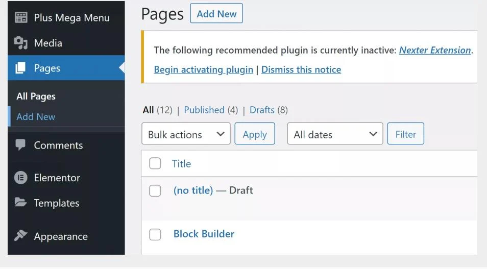
1. Create a New Web Page
Now, as is customary, we must build a new page. Navigate to the Pages area, choose All Pages, and then click Add New.
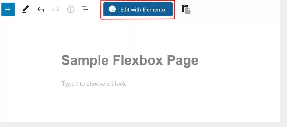
2. Open Elementor
The WordPress page builder window will now appear on your screen. Give this new page a title, and click Edit with Elementor to access the Flexbox containers.
3. Add a New Container
The Elementor page builder UI will appear on your screen. You may also drag and drop a container from the sidebar to add a further container or click the plus symbol and select a structure.
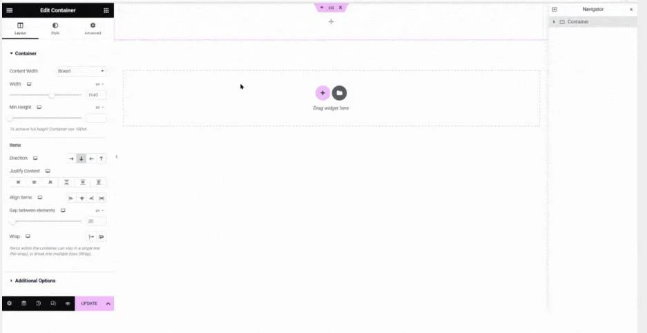
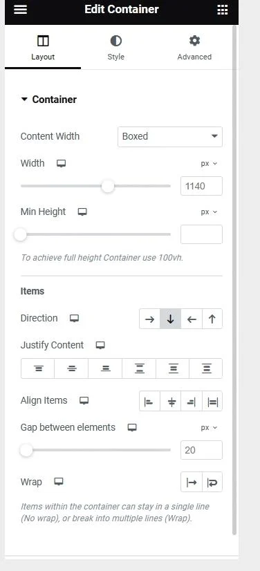
4. Stylize the Container
After you’ve created a container, you’ll have access to a plethora of customization choices. You may change container type, width, height, orientation, alignment, and other settings.
5. Drag and Drop Widgets to Containers
It is also simple to add widgets to containers. Drag and drop the relevant widget from the Elements tab over the Add icon in the container.
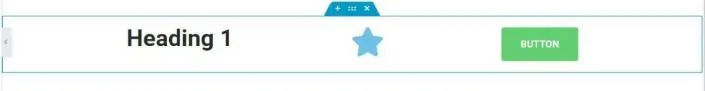
6. Customize Widgets
You may alter the contents of a container just like you do the global container settings. You may change the direction, alignment, justification, spacing, wrap, and other settings. For instance, I’ll have one header, one video, and one social share icon.
7. Publish Your First Flexbox Web Page
You can make a lot of containers, duplicate them, and move them around. Repeat these actions as you add more pieces, and then click the Publish button to make your web page live. You may also interact with your new Flexbox web page by clicking the Preview button.
Essential Differences between the Traditional Section and New Elementor Flexbox Containers
There are some significant changes between the traditional section and the new Elementor flexbox container regarding technical, visual, performance, and alignment. They are listed below.
Technical Differences
You must establish a segment and split it into columns in traditional Elementor, which means you must specify a grid. Then, you may start adding widgets and components. However, you can only add one area within a section, limiting your capacity to create unique grids. The Elementor Flexbox Container is similar to a section. You may, however, put as many containers as you wish inside a container. This allows you to construct unique grids before adding widgets and items to the posts and pages you want.
Easy to Align Elements
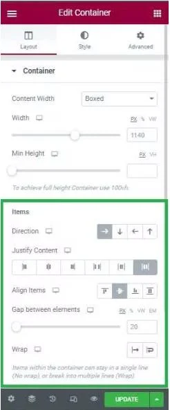
Traditional Elementor has only three alignment options: left, center, and right. However, the Flexbox Container offers greater alignment choices. You may align content horizontally and vertically to guarantee that all items have equal space distribution. Use the Justify Content choices (start, center, end, space between, space around, and space evenly) for vertical alignment. Use the Align Items options (start, center, end, and stretch) for horizontal alignment.
Performance Difference
Because customizable grid generation is difficult with standard Elementor, you must rely on z-index, margins, and other CSS coding. This may cause cache bloat, decreasing the loading speed of the website’s pages. But, in the case of Elementor Flexbox, you don’t have to rely on the same things to keep your website’s page loading speed up. You will see these disparities if you develop two complicated websites employing these two capabilities independently.
Advantages of Using Elementor Flexbox Containers
There are various advantages to using Flexbox containers instead of standard blocks for website design. Among the key advantages are:
- Granular Control Over Page Layout
Elementor Flexbox containers provide extensive flexibility over content placement and page structure. You may easily construct horizontal or vertical layouts. Furthermore, you may control the direction of text, alignment, padding, width, and so on at both the individual and global levels.
- Layouts that are Device Responsive
The new flexible parts are intended for smaller devices. You may customize the layout for multiple screen sizes, including desktop, tablet, and mobile. Consequently, all material on your web pages is mobile-friendly and simply accessible to the end user.
- Clean Markup
As previously stated, using the block display property to create many sections or horizontal divisions causes DOM bloat and clutters the markup. On the other hand, flexible containers allow for a flat content arrangement without the need for columns and sections. As a result, the website’s code is simple to execute and loads faster on various devices.
- Infinite Nested Sections
The classic block builder’s main constraint was that it could only house one sub-section inside a section. A Flexbox, on the other hand, allows you to add a container within a container indefinitely. As a result, you may develop more complicated layouts without having to worry about clogging the markup with superfluous DOM.
- Clickable Sections
Previously, widgets within a section could be made clickable, not the entire section. Elementor, on the other hand, allows you to hyperlink an entire area using Flex containers. It is an important feature from the end user’s perspective since they no longer have to seek particular clickable components to navigate to another page but can just click on the section.
- Create More Optimizing Layouts and Reduce DOM bloat:
With Elementor Flexbox Container, you may specify content direction, item alignment, content justifying, and so on, which will replace sections columns and inner sections in previous Elementor sections.
Reduce DOM bloat: By eliminating superfluous inner div containers and then aligning objects using Flexbox CSS, the Flexbox container decreases the number of columns and inner sections while building nested layouts. Those eliminated divs will reduce the page code, increasing the speed and performance of your page.
Can I Combine Elementor Addons With the New Flexbox Container?
Yes, you may use Elementor addons in conjunction with Flexbox containers. Elementor Flexbox containers combine easily with addons and third-party plugins, so there is no need for a workaround. Addons are required to allow further functionality and customization options in the Elementor page builder. You may add over 120 customized widgets to your website by installing The Plus Addons for Elementor. You may access specialized sections and tabbed widgets with
The Plus Addons. As a result, you can construct sophisticated layouts without coding, making organizing material on your website easier. Furthermore, The Plus Addons are entirely compatible with Flexbox containers.
Conclusion
You can see why there is so much buzz about this new Elementor addition. The Elementor Flexbox container is a true godsend for those WordPress website builders seeking solutions to make their websites more optimized, quicker, and responsive regardless of device size.
The idea is that you can quickly convert your already developed website into a container-based optimized website. However, the flex container is currently in the testing phase.
About the author
Hi, I’m Edy Werder. I write hands-on guides about Proxmox, homelab servers, NAS, and WordPress, based on real setups I run and document.
No sponsors, no fluff—just real configs and results.
Enjoying the content?