By Edy Werder — IT Consultant & Tech Blogger
I’m currently rebuilding a website with Divi 5. Along the way, I keep running into things that aren’t obvious, aren’t documented, or just work differently than expected. I collect them here.
This is a living article. I add new Divi 5 tips as I find them. If you’re working with Divi 5 yourself, bookmark this page.

Tip 1: The + Icon Doesn’t Always Show in the Visual Editor
I was trying to add a new module below a Heading module. But the black + icon that lets you add a module? It wasn’t there.
Here is a short video showing what I mean
Turns out this is expected behavior. The + icon only appears under certain modules, like Text or Icon List. Under others, like Heading, it doesn’t show up.
I confirmed this with Elegant Themes support. It’s not a bug.
How to add a module when the + icon is missing:
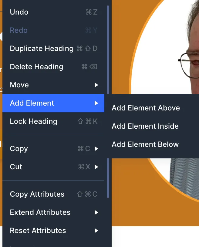
- Right-click the module and choose Add Element
- Here you have some choices to add a new Element Above, Inside or Below
Another way is to go to the command center
- Press Cmd/Ctrl + K to open the Command Center, type the module name, and press Enter.
Coming from Elementor, this felt unintuitive at first. The + button is always visible there. In Divi 5, you need to know the workarounds. Once you do, it’s fast enough.
My Take: I think Elegant Themes should rethink how this works. It’s a visual editor after all. Adding a new module above or below should always be possible with two clicks.
Tip 2: The Default Content Width Is Too Narrow in 2026
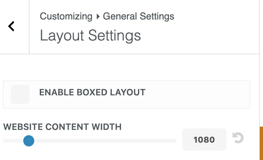
Divi 5 sets the content width to 1080px in the Theme Customizer. The row width defaults to 80%. That means your actual content area is only 864px wide. On modern screens, that feels cramped.
Here’s how the layout works by default:
- Section = full browser width (edge to edge)
- Row = 80% width, capped at 1080px (set in Theme Customizer)
- Modules = 100% of the row
The section is always the full width of your screen. It stretches from edge to edge regardless of the screen size. That’s why section backgrounds fill the entire screen.
The row sits centered inside the section and holds your actual content. The 1080px in the Theme Customizer controls the row’s max-width, not the section.
What I recommend after asking the Divi community:
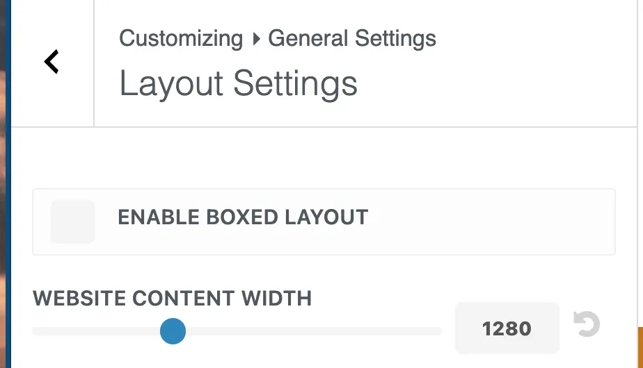
I asked the Divi community on Facebook and Reddit what content width they use. Almost nobody keeps the default 1080px. The most common setup is 1280px with a row width of 80-85%. Some go up to 1400px depending on the design.
One Reddit user made a good point: the default 1080px × 0.8 = 864px actual content width. That’s too narrow for 2026 when most screens are 1920px wide or larger.
If you want to see current screen resolution data, StatCounter GlobalStats tracks worldwide usage. It helps you decide what content width makes sense for your audience.
To change the content width, go to Divi → Theme Customizer → General Settings → Layout Settings and increase it to 1280px.
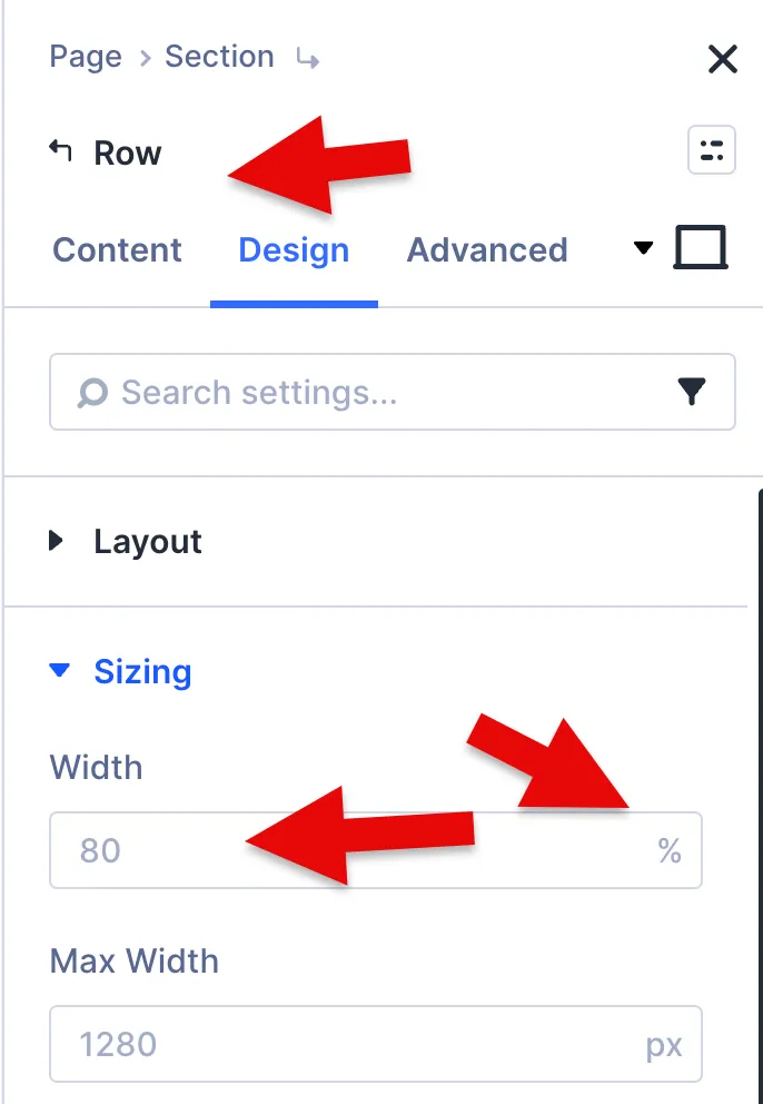
How to change the row width:
The row width is not in the Theme Customizer. You change it per row in the Divi Builder. Open any row, go to Design → Sizing, and adjust the width from 80% to 85% or 90%.
To avoid having to do this for every row, create a default row preset with your preferred width. That way, every new row starts with your setting.
My Take: The default 1080px made sense years ago. I changed mine to 1280px and kept the row width at 80%. That alone gives me 1024px of actual content width instead of 864px. But keep in mind: wider isn’t always better. For text-heavy sections like blog posts, keep the text block under 800 pixels wide.
Beyond that, lines become too long to read comfortably. If you want full control over this, Divi 5 supports clamp() for fluid widths that scale smoothly across all screen sizes. That’s a topic for another article.
Tip 3: Enabling More Breakpoints Doesn’t Slow Down Your Site
Divi 5 comes with three active breakpoints: Phone, Tablet, and Desktop. You can enable up to seven, including Phone Wide, Tablet Wide, Widescreen, and Ultra Wide.
But does enabling more breakpoints add extra CSS and slow down your site?
I asked Elegant Themes support directly. The answer: no. Enabling a breakpoint just makes it available in the editor for previewing your design at that screen size. Divi only generates CSS when you actually set a custom value for a breakpoint, like a different font size or padding. If you don’t change anything at that breakpoint, no extra code is added to the frontend. Values simply inherit from the next larger breakpoint.
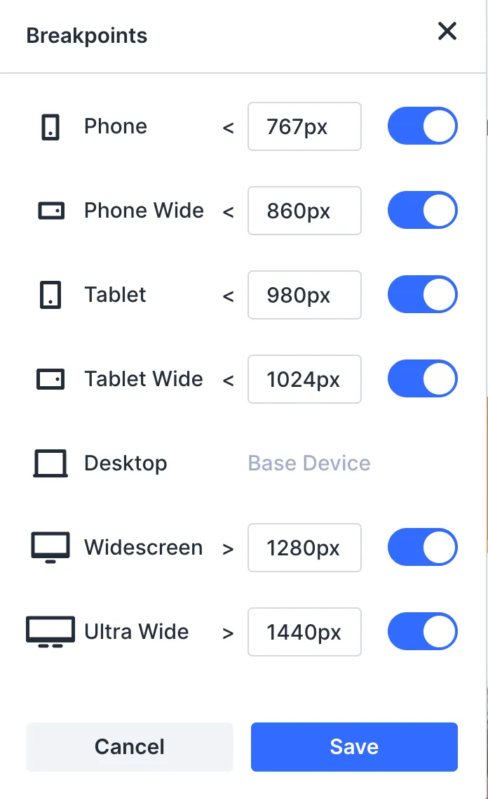
[Screenshot: Sitewide Responsive Breakpoints modal showing all seven breakpoints]
What about clamp()?
In Tip 2, I mentioned that Divi 5 supports clamp() for fluid sizing. If you use clamp() for your widths, spacing, or font sizes, extra breakpoints won’t add much value for those properties. Clamp handles the smooth scaling between screen sizes automatically. No breakpoints needed for that.
Elegant Themes published a detailed guide on how to use clamp() for responsive content widths in Divi 5. Worth reading if you want to go deeper.
Extra breakpoints are most useful for things you want to control manually. For example, changing a three-column layout to a single column on mobile, or hiding a module on certain screen sizes.
I also confirmed this with Elegant Themes support. They said the only reason to override clamp() at a specific breakpoint is if the fluid scaling doesn’t look right at a certain screen width. In that case, you can set a fixed value at that breakpoint to take over.
My Take: Enable all seven breakpoints from the start. It costs nothing and gives you flexibility. But don’t expect them to improve sizing if you’re already using clamp(). Breakpoints and clamp() solve different problems. Breakpoints give you manual control at specific screen sizes. Clamp gives you automatic fluid scaling across all of them.
I keep adding new tips as I build with Divi 5. Bookmark this page if you want to stay updated.
If you’re new to Divi 5, start with my Divi 5 Review for the full picture. I also wrote about Divi 5 Design Variables, which connect to several tips in this article.
If you want to try Divi 5 yourself, you can get it here.
I’d love to hear from you — was this article helpful? Share your thoughts in the comments below. If you prefer, you can also reach me by email or connect with me on Reddit at Navigatetech.
About the author
Hi, I’m Edy Werder. I write hands-on guides about Proxmox, homelab servers, NAS, and WordPress, based on real setups I run and document.
No sponsors, no fluff—just real configs and results.
Enjoying the content?